Color swatches, dropdowns and checkboxes for Shopify products
Values shoppers pick from, from dropdowns to swatches and fonts, each with an optional price.
Quick answer
The 10 Choice option types give shoppers a list of values to pick from: Switches, Dropdown, Radio buttons, Checkboxes, Buttons, Color swatch, Image swatch, Color dropdown, Image dropdown and Font picker. Each value can cost a fixed amount or a percentage of the selected variant's price, and a free value can be pre-selected as the default.
Last updated
Choice options have a list of values. Each value can have a price: a fixed amount or a percentage of the selected variant's price.
All Choice types
Switches
Toggles, like “Gift wrap” and “Card”
Each value is a toggle the shopper can turn on, and shoppers can turn on several.
In the editor
- Label
- Help text (optional)
- Required
- Values and prices: a name, a fixed or percentage price, and Default
- Width (Full width, Half or Third)
- Choices per row
- Conditions
- Advanced: Tooltip, Charge once per order line
Dropdown
Pick one from a list
Shoppers pick one value from a list.
In the editor
- Label
- Placeholder
- Help text (optional)
- Required
- Values and prices: a name, a fixed or percentage price, and Default
- Width (Full width, Half or Third)
- Conditions
- Advanced: Tooltip, Charge once per order line
Radio buttons
Pick one, all visible
In the editor
- Label
- Placeholder
- Help text (optional)
- Required
- Values and prices: a name, a fixed or percentage price, and Default
- Width (Full width, Half or Third)
- Choices per row
- Conditions
- Advanced: Tooltip, Charge once per order line
Checkboxes
Pick any number
Shoppers can pick any number of values.
In the editor
- Label
- Placeholder
- Help text (optional)
- Required
- Values and prices: a name, a fixed or percentage price, and Default
- Width (Full width, Half or Third)
- Choices per row
- Conditions
- Advanced: Tooltip, Charge once per order line
Buttons
Pick one, shown as buttons
In the editor
- Label
- Placeholder
- Help text (optional)
- Required
- Values and prices: a name, a fixed or percentage price, and Default
- Width (Full width, Half or Third)
- Choices per row
- Conditions
- Advanced: Tooltip, Charge once per order line
Color swatch
Pick a colour
In the editor
- Label
- Placeholder
- Help text (optional)
- Required
- Values and prices: a name, a fixed or percentage price, and Default, plus a Swatch colour per value
- Width (Full width, Half or Third)
- Swatch shape, Swatch size
- Choices per row
- Show value names under swatches
- Conditions
- Advanced: Tooltip, Charge once per order line
Image swatch
Pick a material or pattern
In the editor
- Label
- Placeholder
- Help text (optional)
- Required
- Values and prices: a name, a fixed or percentage price, and Default, plus an image per value
- Width (Full width, Half or Third)
- Swatch shape, Swatch size
- Choices per row
- Show value names under swatches
- Conditions
- Advanced: Tooltip, Charge once per order line
Color dropdown
A dropdown that shows the colour
A dropdown whose list shows each value's colour.
In the editor
- Label
- Placeholder
- Help text (optional)
- Required
- Values and prices: a name, a fixed or percentage price, and Default, plus a Swatch colour per value
- Width (Full width, Half or Third)
- Conditions
- Advanced: Tooltip, Charge once per order line
Image dropdown
A dropdown that shows a picture
A dropdown whose list shows each value's picture.
In the editor
- Label
- Placeholder
- Help text (optional)
- Required
- Values and prices: a name, a fixed or percentage price, and Default, plus an image per value
- Width (Full width, Half or Third)
- Conditions
- Advanced: Tooltip, Charge once per order line
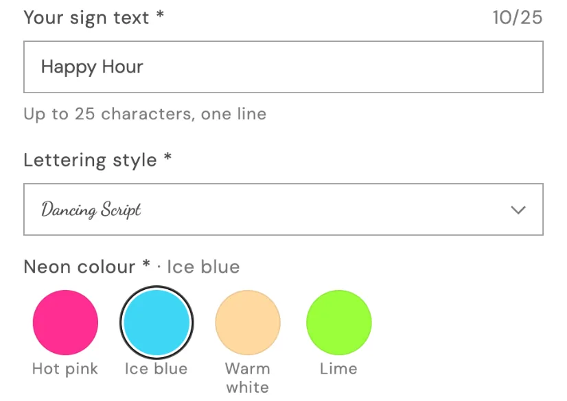
Font picker
Choose a lettering style
Each value is drawn in its font. Offer your theme's heading and body fonts or Google Fonts.
In the editor
- Label
- Placeholder
- Help text (optional)
- Fonts to offer
- Required
- Values and prices: a name, a fixed or percentage price, and Default
- Width (Full width, Half or Third)
- Conditions
- Advanced: Tooltip, Charge once per order line
Adding values
- Add values one at a time under Values and prices, and reorder them with the arrows.
- Or use Bulk add values, one per line. Add a price after a comma, “Premium, 12”, or a percentage, “Gold plating, 15%”.
- Mark a value as Default to pre-select it. Only free values are pre-selected on your store: a default with a price is ignored, so shoppers are never charged for something they didn't pick.
Tip
A number in a value's name, like “2.5 m”, can feed a price formula. This works for Dropdown, Radio buttons, Buttons, Color swatch, Image swatch, Color dropdown and Image dropdown.
Stuck on something?
Check Troubleshooting, or email us with your store URL and we’ll help.
Email support